Magazine and Digipak
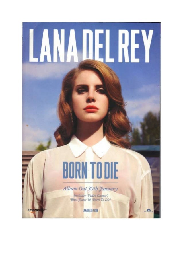
I felt it was essential to use the same theme for the advert and the digipak as it is a key factor is marketing for the audience to be able to recognise your product. The reoccurring yellow font is eye catching and contrasting from the black background found on both my digipak and advert making them look similar to each other. One example of a matching advert and album cover is Lana Del Rey's 'Born to Die'.


Comments
Post a Comment