jazz albums
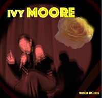
As my choice choice was a mix of the jazz/ soul genre i felt it was necessary to keep my digipak design in theme. When researching other jazz artists didgpaks the common theme was using darker colours as the background and using brighter colours more subtly. Due to the modern twist in my music video i decided to give my digipak a more vibrant appearance however not making it over the top, small yellow details and yellow font was all it took to separate my digipak from being dull from being eye catching and unique. I also followed the theme of having the artists in the centre, as the main focus. I used an editing software called Wondershare to adjust the colouration of the main image in addition to obtaining additional font which is not found on Microsoft Word aswell as distorting the image. Lastly, Wondershare helped me lay one image of a flower on top of another whilst changing the saturation of one to create a more sophisticated look. I also included a rose as it symbolises love however i altered the colour to yellow as it links with the black and yellow theme throughout my entire project (digipak and magazine).


Comments
Post a Comment