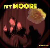
Explaining My Advert
Colour theme: Black and Yellow. When researching i found that most classical, jazz and soul adverts have deeper colour palette, with the main colour being back or just slightly off black. As a result i specifically chose a dark theme for my advert. To contrast the darker colours, I included a vibrant yellow, this is to contrast the darker colours and make the advert stand out if it were in an actual magazine, furthermore the use of yellow connotes the modern twist in the narrative as vivid colours are often associated with more modern cultures.
Main Image: I screen-shotted a clip from my music video (at 39 seconds in) for my advert. I noticed many jazz adverts have the artist who is being advertised performing as the main focus therefore i thought i would continue this trend into my advert. I used photoshop to adjust the saturation to make it look more old fashioned to further link with the old school style jazz/ soul theme. Despite making the image darker the yellow contrast provides the advert with the vividness it needs to capture readers attention.


Comments
Post a Comment